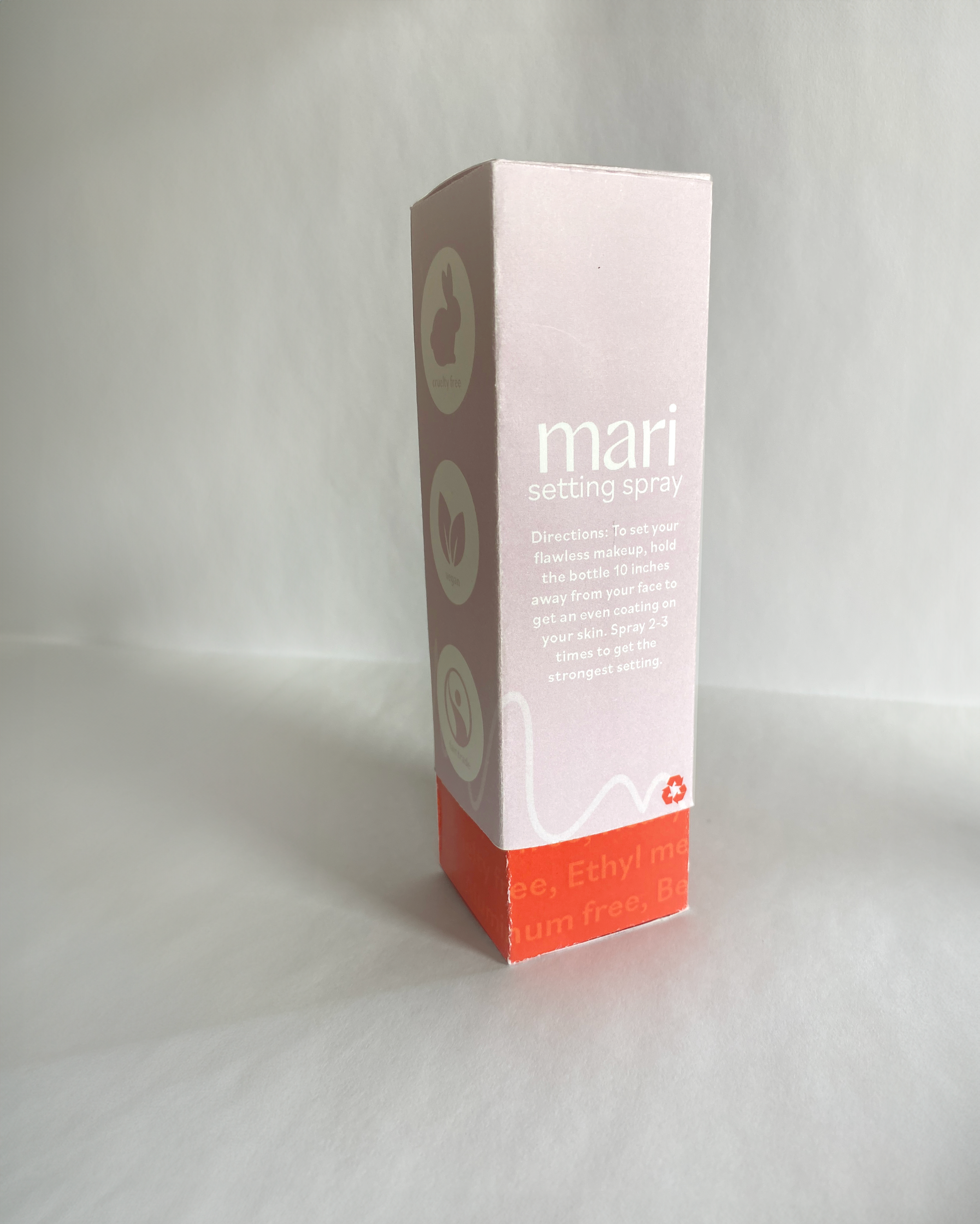
Mari Cosmetic Packaging
From the beginning of my design process, I knew I wanted to work with ethical products. Sure enough, I found that cosmetics are one of the most overlooked products when it comes to harmful chemicals and unethical production practices. I chose to dream up what it might look like for a cosmetic brand to produce kindly-made products that are also kind to your body. I was drawn to the idea of a sleeve-style box with the inside reading all the harmful things that are NOT carried in Mari's products. This idea was important to me because as the name Mari stands for transparency, I wanted my design to mimic that honesty with the reveal of the truth as you open the box, further considering colors and aesthetics, I wanted something bold yet gentle to exemplify Mari's place in the cosmetic world; pioneering the field in a welcoming manner. I chose a fun sans-serif for my wordmark and paired it with a modest, simple, sanserif typeface for all extra information. This type of paring is similar to my color scheme in its familiar yet fun, orange, and the calm, understated lavender.


